Former BRB Concept Artists Upload Sonic Boom Concept Art
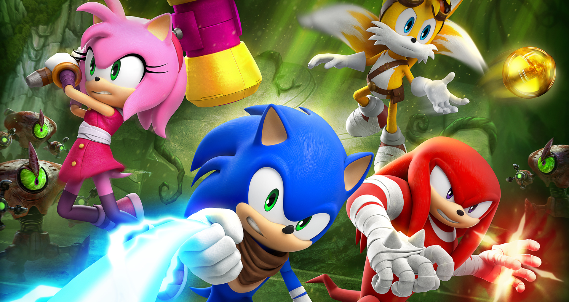
We’re getting more details into the process behind the making of Sonic Boom: Rise of Lyric on Wii U. Two former concept artists for the game have been uploading loads of concept art for the game. There’s loads of sources from multiple links as well. Loads of them. Some of the art was even uploaded earlier this year and not noticed by anyone until now. There’s even concept art for Shattered Crystal posted. There’s so much art and so many different links that Andrea Ritsu of Sonic Stadium has been uploading all the images into one single gallery for convenience.
Here’s what we know based on the concept art and explanations by the artists:
- The game was worked on longer than initially thought, as earlier as 2010. Sonic’s redesign was finished over two years ago. Eggman’s redesign was still massively under development by that point.
- The designs for the characters were going to be much different. Ideas for Sonic were thrown around the most. He didn’t look like Sonic at one point and later there’s concept art of him fully clothed. Eggman didn’t even look like Eggman. At one point Knuckles had a belt, Lyric was to be an owl, and Amy had a dress similar to her main series counterpart. Later on, she might have worn pants instead of the dress she wears now.
- Chao were planned to be in the game (called Chaos) and looked like baby dragons.
- Rise of Lyric was codenamed Project Apollo. A working title for the game was Sonic: Origins.
- Eytan Zana, a concept artist at Naughty Dog for about 4 years now, helped out.
- One of the two artists left in 2013.
- A lot of the art showcasing the levels and bosses were changed in some way. Some areas were shrunken down. Others had colors removed or draw distance pulled in. Others were removed completely, such as an image clearly showing a boss fight in a snowy mountain and another with a hub world that looked more like Green Hill Zone.
- Even some gameplay mechanics might have been removed. One of the art suggests four player co-op was proposed and another suggests the boost may have returned.
The images are still being looked over and more are being discovered as of this article’s writing. If there’s anything else new to pass along to you we’ll let you know.
UPDATE: Now there’s evidence suggesting that the game was in development since 2009!
This post was originally written by the author for TSSZ News.

![[ID: icbWiGbvci8] Youtube Automatic](https://lastminutecontinue.com/wp-content/uploads/id-icbwigbvci8-youtube-automatic-60x60.jpg)


![[ID: X7t1T3bcpCU] Youtube Automatic](https://lastminutecontinue.com/wp-content/uploads/id-x7t1t3bcpcu-youtube-automatic-360x203.jpg)
![Private: [ID: 3C-rdem9IRk] Youtube Automatic](https://lastminutecontinue.com/wp-content/uploads/2024/04/private-id-3c-rdem9irk-youtube-a-360x203.jpg)
Interesting. 😮
Great concepts (minus their vision of Eggman and IMO Chao). The world they drew from these looked fun and engaging — a shame the execution of presenting this world in a video game failed.
A lot of this concept art is really strange to say the least, just imagine the backlash if they went with some of those designs. Yeesh!
And why is there a small little animal with the caption ‘Chaos’?
????
Fantastic designs. The Time Travel element was going to be strong with this one. Young Robotnik is lovably goofy looking. Any of these Sonics could have worked really.
All those drastic Sonic redesign concepts… only to stick to the one closest to his modern form, yet they somehow still managed to make even that look ugly, despite adding only seemingly superficial changes. Still can’t get over how tacked-on the scarf and sports tape look. Not the sharpest bunch of designers, that’s for sure.
But the background concept pieces were gorgeous, I’ll give them that.
the game would gone good if they got the right team leader and machine to work with…!!!!!!
well since its SEGA property they could do whatever they want by 2015 it can be ported different platforms since it didn’t turn out well for WiiU at all, limitations were everywhere on designs due to BRB members where complaining that SEGA made a huge mistake releasing on inferior system to make a game on…but its done so SEGA is aware of Cryengine3 is capable to run maximum settings on PS4 and PC only that could have produce more money eventually like generations did and better than any Hedgehog engine games with this amount of details…impressive artworks, i hope the indie developers pick up what they left off, i can’t wait what the potential fan games dissect the entire boom game data…they can make better results for PC gaming….imagine what can fans could do with this power !!!!
Cryengine shouldn’t be used for a platforming co-op game, let alone a Sonic game period.
it can, haven’t notice their is one SONIC fan game utilize Cryengine3….and another one is as well using the same engine and based of crash bandicoot games..their are many fans trying doing the impossible to possible…Cryengine3 and Unreal3 and 4 are platforming ready…you need a way more powerful computer to render the entire world like forests and oceans, and far distances data calculations that put your GPU to work…and WiiU is not the machine to do this stuff..funny i really want to know how they did it ??? using 3 cores and low end GPU from AMD…NOT VERY EASY FROM BRB TEAM …….lot of cut out and changes after finalizing…
Don’t understand your hate for the Wii U, It’s a powerful system, just not many titles have been released that utilize this potential.
I can understand your argument for fangames being used with Cryengine, but a fangame and an official product are two different things. Do I think it could be used with a Sonic game? Probably. What I’m saying is that it’s not suited for such gameplay.
Part of the reason it failed for SB:RoL is because they tried to make it do things it couldn’t do. It’s not supposed to support co-op and all the playable characters onscreen. Even if they didn’t use Cryengine it would still be a disaster considering their design choices.
Dang! These backgrounds are beautiful!
A nice mixture of fantasy and sci-fi, with a dash of rustic steampunk and sleek cyberpunk to set the tone. Kinda reminds me of SatAM and “Underground”.
Some of that concept art is brilliant. Some of it… not so much. If someone had come to me and said ‘this is our design for Sonic’, I’d have questioned what they were smoking, and was it legal to smoke it.
These redesigns for Sonic are hideous, awful and creepy, and I will never understand anyone who says they look good. They look like what would happen if your art staff consisted of mentally ill people from tumblr. I can’t get over the sheer ugliness of that fat dumpy looking “Sonic” they had at one point, looks like a reject from a Don Bluth film about pedophilia.
They might’ve not fit Sonic, but I though some of the redesigns were kinda cute. Had they gone with those designs, people would definitely have no problem in differentiating the continuities.
The problem with some of the more extreme redesigns though, is they lose the essentials of the character.
Back in 1998, Eggman changed substantially, but he was still obviously the same character he was before. The key elements of the design were still very much there: red jacket, black trousers, pince-nez glasses, bald head, HUGE orange moustache, and epic fatness. But when it comes to these concepts, the essential Eggman-ness is completely absent; it just looks like a collection of random hippies and nerds!
ROFL’ing from Eggman redesigns.
At least we know what Eggman used to be, back when he was younger.
if no one see it in eggman base in the cartoon ther is a chao egg a black egg with red lines
WOW.
Well, hopefully this will teach everyone to appreciate the final designs better, as they really could have been a whole lot worse if any of these images are any evidence. Suddenly a buff Knuckles and Eggman and a Sonic with blue arms don’t seem so bad, now do they?
I have to say though, that one image of Sonic with the pants actually looks interesting, it doesn’t really take away from his appearance all that much. And it looks like at some point they were going to compromise between the arm colors, giving him a layered blue and peach arm pattern. Nonetheless, I still prefer the final design they picked out for him, it sticks the closest to his regular appearance, even with the blue arms.
It’s always nice to see concept art for a game revealed, it always shows the creative thought process that went behind making the face of the game. It’s certainly an interesting treat to see all of those radical redesigns that Iizuka got a little nervous about. Personally though, I would have been more nervous of Eggman’s redesigns, that was perhaps a step too far in the wrong direction. But then again, that literal hedgehog Sonic…or the Sonic wearing clothes……
> Now there’s evidence suggesting that the game was in development since 2009!
No, there isn’t. The resume of one artist says he was Lead Concept Artist at Big Red Button Entertainment for Games / “Unannounced IP’s”. Notice the plural. Assuming that they started work on Sonic Boom in 2009 already is jumping to conclusions.
Suggesting != Confirming
It’s not even suggesting, it’s a wild guess.
Still seems odd they ever thought about changing the character design so much. There is a reason sonic has survived so long as a franchise and its not consitent AAA game design. People love the characters.
Knuckles looks even more Buffle’y here:
https://imgur.com/a/i1YpZ#79
Amy’s facial expression in that picture…
Makes me hard
Totally not what I had in mind… but hey, I won’t judge.
Not my intention at all, either. Geesh. BTW, Sega should have Frito Lay make the Ultimate Buffles chips…
http://4.bp.blogspot.com/-iWqRqFL0ieQ/T6wo0124wFI/AAAAAAAAAYc/5QnMki59LeM/s1600/RufflesUltimate.jpg
Ew all of this except those backgrounds look like month old baboon vomit.
Says the guy who has that face for an avatar.
Mang, Yu Yu Hakusho was a great fucking show.
I’m familiar with the show. I just find it ironic that he called the designs ugly while he had that particular face as his avatar.
Game was developed since 2009, yet the graphics are like ps2, there’s multiple glitches, and overall the game is just bad!!
Graphics don’t mean anything when it comes to the gameplay. The important thing is how it plays. And while most find it okay, they also find the overall repetitive combat and exploration to be boring; which is the game’s biggest problem.
Holy gebus, that’s a lot. Concept art is probably my favorite part of any game. And I really like the different designs of Sonic, though I’m glad they stuck with what he looks like now. :3
Wasted talent on a terrible/mediocre sub-series. *shrugs* So how about that Sonic Runners mobile thing? Any news on that yet?
Apparently those alternate Eggman concepts were for when the team would travel back into Doctor Eggman’s past at some point in the game. I guess it got scrapped since a lot was going on already (and other corporate complications perhaps?…), and they didn’t really want to focus on the returning cast’s backstory in this world. So it’s not like Eggman was always going to look this way, but man, wouldn’t that still have been weird to witness?
Chao were gonna be in this game?!?! As in Chao Gardens?!?!?!?! DASFHJSADNGKDAA What the hell SEGA?! Why wasn’t this put in?!