Reasonable Assessment: Sonic’s Design Ain’t Broke, Don’t Fix It

Yeah, I know. I’m just a clingy fanboy that hates change, right?
If you’re reading this, you’ve likely seen the leaked Sonic The Hedgehog movie design.
And you’ve also seen the thousands of reactions to it as well. Negative reactions, I might add.
There’s one word that comes to mind when I see this design: “Pointless.”
Not “cringy.”
Not “bad.”
Not “ugly.”
Not “I’m sorry Boom Knuckles.”
But “Pointless.”
Before the development of the original Sonic The Hedgehog (1991), SEGA artist Naoto Ohshima drew several conceptual designs to help determine what Sega’s mascot would be going forward. While on vacation in New York, he took it upon himself to stand in Central Park and ask random people which design they preferred. The clear winner was the drawing he made of a speedy little hedgehog named Sonic.
Even before he was a thing, Sonic’s design was instantly appealing. It’s the one thing about Sonic that we can all agree was perfect from the start.
It’s iconic. Instantly recognizable. Kid-friendly, but cool. Attitude, but age-appropriate.
It’s spiky, so it’s got edge. It’s cartoony, so it’s fun. It’s blue, the favorite color of his target audience.
The strengths of Sonic’s design have been proved over and over again. He’s got plushies, pillows, toys, comics, posters, and cartoons. His design became the face of an underdog company that took down a 90% market-share giant that no one thought could be dethroned. His commercials, loud and in-your-face, were the anthem of the counter-culture kids on the playground.
And he’s still here. Any random kid on the bus or adult behind the counter of a gas station recognize him. Game after game, good or bad, you simply can’t kill Sonic. His design won’t allow it.
Yet every time someone new gets a hold of the Sonic brand, the first they want to do is muck with the design. “Here, this will fix Sonic!”
Except it won’t. Because it’s not broken.

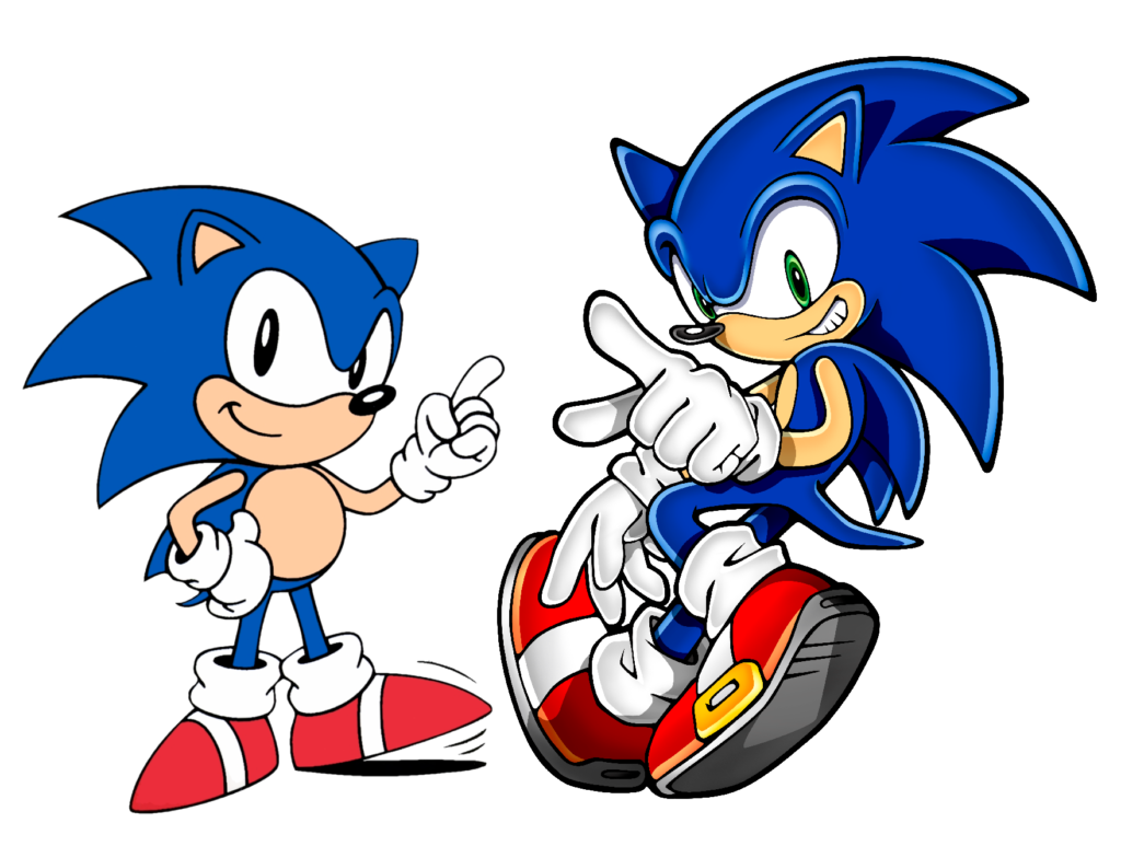
I’m not outraged. I’m not hot with anger. I am not touting Sonic’s design as some holy sacrament that can’t be altered or you commit blaspheme or whatever. After all, Sonic’s modern design is technically different from his classic one, but it’s perfectly acceptable because it still understands the central essence. Sure, this new movie design might be somewhat cute in the right light, but I am ultimately puzzled by the pointlessness of these decisions.
What case is there for changing Sonic’s white gloves to white fur-hands? What problem does that solve? What previously-excluded market demographic does that appeal to?
Why get rid of Sonic’s trademark “mono-eye”? According to executive producer Tim Miller, “it’s going to look weird if we don’t” change the mono-eye.
Why? Is this all part of the effort to make Sonic more realistic? What a fruitless task. Sonic is a walking, talking hedgehog with sneakers. He’s never going to look grounded in reality. He was never meant to and never should because it just doesn’t make sense. The closer you push him towards reality, the more absurd he becomes. And to what avail? Is our suspension-of-disbelief supposed to flow much easier now that this anthropomorphic rodent nose has nostrils?
I leave you with a quote from Ohshima-san, the aforementioned artist that drew the first Sonic The Hedgehog, the single man whose opinion should weigh most on the subject of Sonic’s designs.
“Sonic is a fairytale of a hedgehog, so he doesn’t need to be designed closer to a real hedgehog, even in live-action. Mickey doesn’t become a mouse in live action, does he?”
Sonic’s design ain’t broke. There’s no need to “fix” it. That’s my assessment. Hope it’s a reasonable one.
This post was originally written by the author for TSSZ News.

![[ID: AP5Le9PqMPg] Youtube Automatic](https://lastminutecontinue.com/wp-content/uploads/id-ap5le9pqmpg-youtube-automatic-60x60.jpg)
![[ID: 6FCDhjLdu48] Youtube Automatic](https://lastminutecontinue.com/wp-content/uploads/id-6fcdhjldu48-youtube-automatic-60x60.jpg)
![[ID: g5V-gh8heQw] Youtube Automatic](https://lastminutecontinue.com/wp-content/uploads/2024/09/id-g5v-gh8heqw-youtube-automatic-360x203.jpg)


This article wins the internet tonight completely. Let me add…ever notice that there is quite a trend in redesigning things for age demographics….well what I mean is younger generations…a.k.a. reboot after reboot. Is it just me or has the mainstream (hollywood) world and DISNEY completely run out of ideas? Even Sequels are just really leaving us with a lot of “ummmm okay that happened!” The fandoms are left baffled, confused and at war with each other. Its almost as bad as politics when you look at it at all angles.
More like it IS politics at this point. *cough* captain marvel *cough*
At this point, I feel the only option we have to make SEGA and all concerned understand our concerns is a complete and total boycott of the Sonic franchise.
Stop buying the products regardless of quality, stop giving the brand exposure via videos, articles, fan art and the like, just stop supporting Sonic in any shape and form until the franchise is made financially unviable.
Of course even if any number of people actually did this, it won’t bankrupt SEGA or anything, nor am I suggesting that this is what we ought to do this for as SEGA are perfectly capable of supporting and creating quality products outside of their flagship brand and we should support those wholeheartedly, but Sonic the Hedgehog as of now serves as nothing more than a needless expense on what is essentially a self-funded lampoon on an otherwise competent corporation.
Excuses, debates, critique and supporting the once-in-a-blue-moon decent product, which compared to SEGA’s competition in the market cannot even compete, simply isn’t enough anymore. Either we vote with our wallets and refuse to fund this dead horse of a franchise going forward in any of its form, or SEGA will continue to be the laughing stock of the media industry forever more.
Please consider this.
…Yeah. Pointless. That’s the word for it.
Also uncanny. And torn between two extremes.
But yes, overall, pointless.
There’s a great Twitter chain describing this in greater detail on why this is happening, why this pointless move is being made. Lost the link to it, but it can be boiled down to “Even though Japanese franchises makes billions of dollars and far more money than anything from Hollywood, and Sonic himself makes about 2 billion more than The Fast and the Furious makes, Hollywood won’t even follow the money and just assumes that they’re the central culture and they can do anything better.”
Now that I’m thinking more, I’m getting annoyed by one particular element in all this. For every single reveal of the design, it’s seems to be a different design. This wasn’t even the final word, there’s another design seen after this which is like the Fan Sonic Movie design mutated beyond hope. All of the posters and leaks give us a different flavor of awful, with only partial consistency.
It makes it seem like they don’t know what they’re doing at all, (even more so than we originally thought) and this indecision makes it seem like they can’t even commit to one awful idea. At this point, I’d think I’d take the first poster design, because at least that’s awful full stop and a firm statement of expectations, not this half-step, compromise, could-go-either-way design. At least the first was definitively awful. This just introduces more unneeded confusion and doubt in my already stressful life.
What bothers me is that people who aren’t fans of sonic call those who are babies cause we’re complaining about something that’s for kids. When they say kids, what age do they mean? My 8 year old cousin plays Sonic and she generally finds this new design gross. 100% agree on your article. I will not be watching this movie, unless it comes out on VHS.
The monoeye comment really says it all so I’m really glad the idiot said it, if I recall didn’t the hacks at RBR say similar things about giving Sonic blue arms which this design also has which I doubt is a coincidence.The ideas from both of them like white fur “gloves”, toliet paper, fecal colored scarfs and messing up the shoe design all have a certain root mindest which I’m still trying to pin down but part of it has to come from not caring about the character so it has to be molded into their image which to RBR was to be like the overated games they previously worked on and for these movie folks it’s through the lens of every awful CGI-real world movie based off cartoon characters.
One of the things that makes Sonic’s design so iconic is the heavy use of the Golden ratio which the redesign almost completely disregards.
Hey, what do you know? An actually reasonable assessment.
I’m sure this design must be appealing to SOME people. The people making unironic fan art of it is already a sign. If not some new fringe of the Sonic community, at least young kids might find it appealing, or at the very least just won’t question it one way or another.
Still, that’s about as far as I can forgive it. Even if you took all the cringey elements away, it is still largely pointless. The whole point of having a Sonic The Hedgehog movie was to launch Sonic’s brand and marketability to new heights. So if that’s the case, wouldn’t it make more sense to use a design that’s closer to the already marketable design he has now?
It’s like you said, trying to make Sonic look “realistic” is a pointless venture because no matter how inspired by reality you make parts of him look, it’s not going to change the fact that his whole concept isn’t grounded in reality to begin with. Sure, the Pikachu movie is doing something similar, but at least they aren’t straying from their original iconic designs. They still look fantasy-based, they just have “realistic textures” added to them to make them “blend” into their setting a little better.
This design doesn’t accomplish that nearly as well. It’s distracting because it looks awkward on it’s own, and it’s also distracting because it’s a freaking giant blue hedgehog! I feel like this is just the continuation of a dangerous precedent that Hollywood live action adaptations are doing with cartoon characters, that their designs and appearances must be heavily changed so that they look as realistic as possible. But again, these are CARTOON CHARACTERS! They shouldn’t have to change that much to fit the world that they’re in. If anything, it needs to go both ways, the world needs to be changed and set up in a way so that they belong there and the characters themselves only have to meet the world half-way in turn. Who Framed Roger Rabbit and Rocky And Bullwinkle are probably the best examples I can turn to for this.
All in all, this whole redesign felt so arbitrary to begin with. I know that Boom got similar gut reactions, but at least in the end they didn’t stray that far from the original designs. Ok, well, Knuckles did, but I’ve softened up to the guy. Maybe that means that this design will sit better with me after some time too, but I feel like this is different from Boom. It’s not change for the sake of establishing a new intentionally radically distinct tone like Boom was trying to do. It’s just change for the sake of “well Smurfs and TMNT did it so this is just what you’re supposed to do with live action adaptations”. It causes more problems than it’s supposed to, and I have a feeling that we’ve still got a few more unfortunate surprises waiting for us when it comes to this movie.