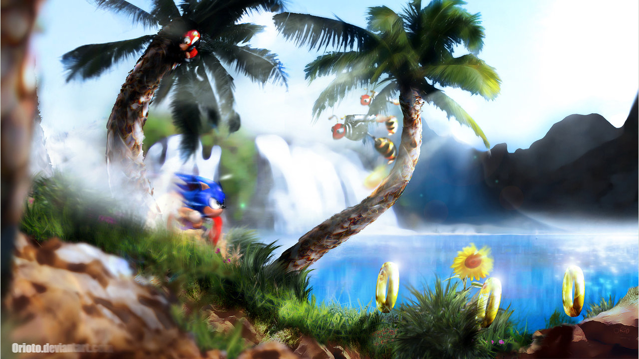
Fan Shows How Next-Gen Sonic Should Look
Another quick story from me today. While browsing the internet I stumbled across the deviantART page of an artist called Orioto. What I saw almost brought tears to my eyes. He’s created a mock-up of how Sonic should look in a next-gen game, in a glorious 2D perspective.
I must admit to being very excited at seeing the early trailer for Sonic Unleashed showing mostly 2D gameplay as I believe Sonic works best on a 2d plane. Orioto agrees with me and has produced a stunning piece of art that Sega needs to take a note of.
Simply entitled ‘Green Hill Zone’ the scene depicts a Sonic 3 style Sonic running through a fantastic looking realistic version of the classic stage. Complete with Badniks and Rings, a waterfall in the background and lush vegitation the scene looks stuning but also is very closely linked to the style of the old games.

Orioto gives a little insight into the scene:
I was checking a really cool project of Sonic HD remake, [link] and it give me the idea to take a shot! I took a remade sprite from the project for the base sprite (but i reshaded it), but the real long work (some 10 hours) came from the mat painting background. All is done from many many little pieces of Photo, even the palm trees are drawn and textured with photo elements.
As good as Unleashed looks I think a game in this style would look better. What do you lot think?
This post was originally written by the author for TSSZ News.


![Private: [ID: 9XEHHZkYqfM] Youtube Automatic](https://lastminutecontinue.com/wp-content/uploads/2025/03/private-id-9xehhzkyqfm-youtube-a-360x203.jpg)
![Private: [ID: vHubTmCcBFQ] Youtube Automatic](https://lastminutecontinue.com/wp-content/uploads/2022/03/private-id-vhubtmccbfq-youtube-a-360x203.jpg)
![[ID: b_xIxzaqG2M] Youtube Automatic](https://lastminutecontinue.com/wp-content/uploads/2024/04/id-bxixzaqg2m-youtube-automatic-360x203.jpg)

whoa that is really mindblowing cool i would love to see a mini game made like that
I keep thinking Sega should do a HD remake of a classic Sonic game, much in the same style of Bionic Commander Rearmed. I’d take a shiny looking Sonic 3 if it looked something like the above picture any day!
Hopefully this will inspire SEGA to do the same.
Look how well both Sonic and Sonic 2 sold on Xbox Live Arcade, I think a HD remake of any classic Sonic game would be very popular.
Awesome,this is so beautiful,so realistic yet it has a true cartoony feel.
Orioto,you have my respect.